This abbreviated guide provides an outline of our Association’s brand. For more information or questions about our brand and identity, contact the Vice President for Communications.
Name
When referring to our association, the College Student Personnel Association of New York State, Inc. should be fully spelled out in all written documents. If the name will be used more than once in a single document, the first use of the name should appear as College Student Personnel Association of New York State, Inc. (CSPA-NYS). Any following occurrences of the name in the document should appear as CSPA-NYS. The abbreviated name should always appear in full capitalization, a hyphen between the CSPA and NYS, and no additional spaces.
Logo
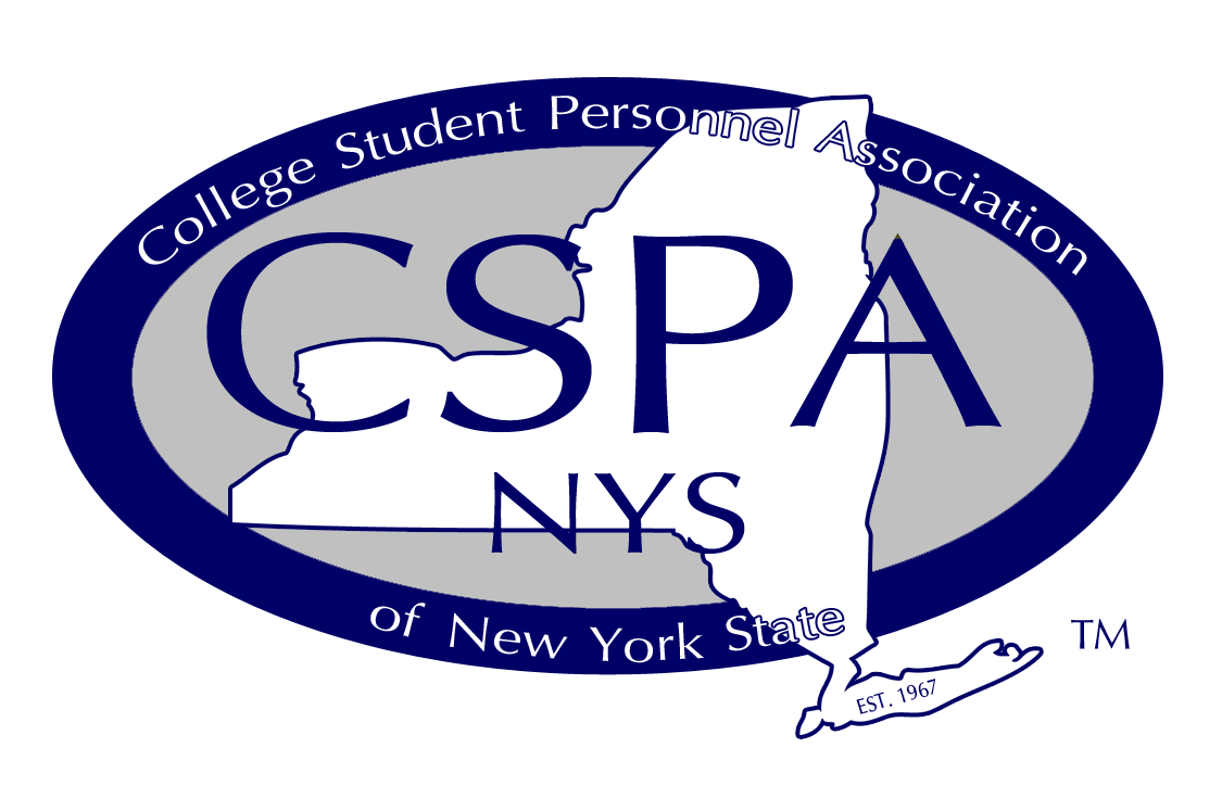
The CSPA-NYS logo has been specifically designed to represent the association. To preserve and ensure it’s consistent reproduction, the logo should not be altered or modified in any way. This logo should always be followed by the ™ (trademarked) sign.
When our logo, crest, or lockup is used, the image should not be impeded or covered by any other logos or artwork and must be at the forefront of any design or use of the logo. The logo must not be altered or rotated. The logo should be ¼ inch away from all sides of a printed publication to avoid bleeding off the edge or being cut off. The logo should be used as a transparent image. All logo alteration standards apply to all CSPA-NYS logos.
Accessibility is important to who we are. When placing a logo on a background, aim for a contrast ratio of 2.25:1 or higher to ensure readability. If the contrast is too low, adjust the background or choose a different one. Check color contrast here.


Colors
Our color palette is comprised of traditional primary ”CSPA-NYS colors matched with vibrant secondary colors. Consistency in graphic design, marketing, and any communication throughout the association is a key component of ensuring brand compliance and association recognition.
We are committed to creating visual content that is accessible and resonates with all audiences. Color combinations should be taken into consideration when designing materials. Our digital color palette has been optimized for compliance with the Americans with Disabilities Act (ADA)—an equal opportunity law for people with disabilities—so that it’s visually effective and functionally useful.


Our typography choices help to express our message. “Myriad Pro” sans serif font serves as the primary font of our association and can be used in bold, italics, or condensed for emphasis. “Karma Light” serif font serves as the secondary font CSPA-NYS. “Satisfy” script font should be used sparingly as accent in headlines to emphasize a single word or phrase, never in all caps.
Due to limitations of the medium, websites and HTML emails necessitate different typographic standards. Other approved fonts for use in these cases include: Calibri, Times New Roman, Arial, PT Sans, and Tahoma.
Typography
Accessibility
CSPA-NYS is designing for accessibility. Using alt-text, captions in Instagram stories, and designing content with accessible color contrast. These priorities allow for our content to be consumed by all audiences regardless of ability. Access our color contrast guide here.


